 A VisualTimmy guide
Why Your Procreate Color Palettes Look Flat (And How to Fix Them)
Flat procreate palettes happen when you rely on single-layer colors without adding depth through temperature shifts, texture, or strategic opacity adjustments.
Flat procreate palettes happen when you rely on single-layer colors without adding depth through temperature shifts, texture, or strategic opacity adjustments. The good news is that fixing this problem requires just a few tweaks to your workflow, not a total overhaul of your color choices.
Below, we break down exactly how to diagnose flatness in your work and the specific techniques that solve it.
Why Most Procreate Palettes Fall Flat
Digital color tends to look sterile because screens render perfectly even tones. When you pick a blue and fill a shape, every pixel gets the exact same value. Traditional media naturally introduces variation through paper texture, brush marks, and subtle color mixing, but Procreate requires you to build that variation intentionally.
The most common culprits we see:
- No temperature variation within a single color family (all your reds are the same warmth)
- Skipping transitional tones between highlights and shadows
- Using pure black or white for shading instead of tinted neutrals
- Missing texture layers that break up smooth digital gradients
- Choosing all colors at the same saturation level without strategic desaturation
Even the best procreate palettes need thoughtful application. A well-curated palette gives you the right starting colors, but layering and blending create the depth.
Add Depth with Temperature Shifts
Every color has a temperature, and shifting between warm and cool versions of the same hue creates instant dimension. If your base red is warm (orange-leaning), push shadows toward a cooler red or even a purple. Highlights should go warmer, toward orange or peach.
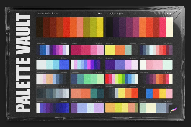
This works especially well for skin tones. Many artists searching for procreate palettes skin tones find that a single beige or brown set still reads flat. The fix: layer a cooler undertone (grayish pink or greenish olive) beneath a warmer surface color, then add pink or yellow highlights. Procreate palettes designed for portraits often include these temperature variations built in, but you can also create them yourself by shifting hue sliders as you sample.
For objects like fabric or foliage, pick three versions of your base color:
- A desaturated, cooler version for shadows
- Your mid-tone base
- A warmer, slightly more saturated highlight
Apply them on separate layers and blend at low opacity. The temperature contrast reads as light and form, not just value change.
Layer Texture to Break Up Flatness
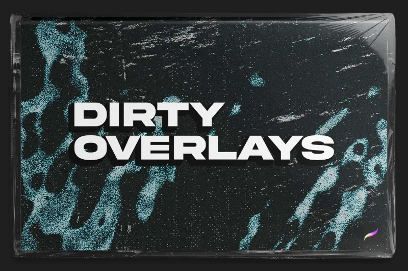
Smooth gradients scream “digital.” Adding subtle texture instantly makes your work feel tangible. We recommend keeping a dirty overlay at the top of your layer stack, set to Multiply or Overlay at 10 to 20 percent opacity. This adds paper grain or canvas weave across your entire image without muddying colors.
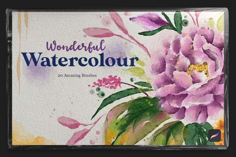
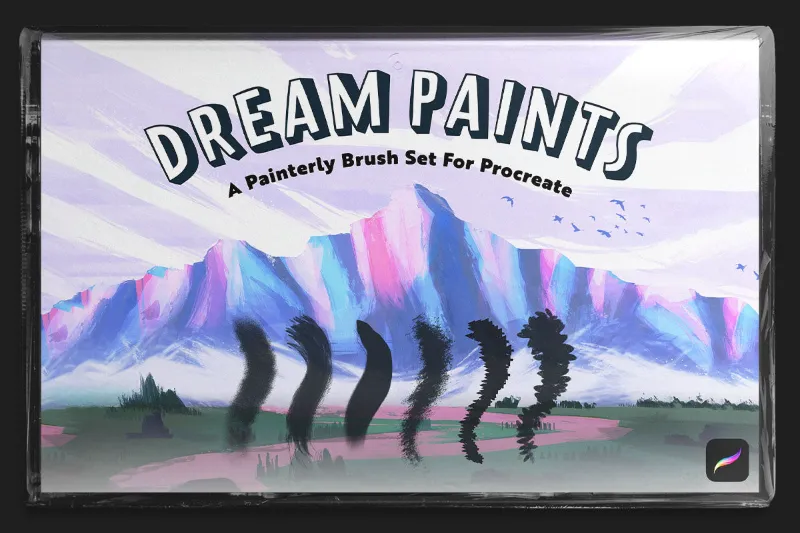
For localized texture, pair your color choices with brushes that have natural variation. A watercolor procreate brush deposits pigment unevenly, creating lighter and darker spots within a single stroke. Halftone brushes procreate add dot patterns that simulate print texture. Even a dreamy sketch brush set can rough up edges and make fills less sterile.
If you’ve already painted with a hard brush, you don’t need to start over. Add a new layer above your flat color, set it to Overlay or Soft Light, and paint over areas with a textured brush in a slightly darker or lighter version of the base color. The texture layer interacts with the color below, adding visual interest without changing your composition.
Check the latest pricing and grab our code to access texture packs that pair perfectly with color palettes.
Build Palettes Around Harmony and Contrast
Flat artwork often suffers from colors that are too similar in saturation or value. Even if you’re using a cohesive palette, you need a saturation hierarchy: one dominant saturation level, a secondary level, and small accents.
Here’s a simple test: convert your canvas to grayscale. If everything turns the same shade of gray, your values are too close. Adjust by pushing shadows darker and highlights lighter, or by desaturating mid-tones so your focal point (at full saturation) pops.
The Procreate Handbook explains how to organize and save custom palettes, which is essential once you’ve dialed in a working set. We also keep a neutral palette (warm and cool grays, off-whites, near-blacks) separate from our chromatic colors. Mixing a touch of neutral into every color you use prevents that “straight out of the tube” look.
For quick experimentation, palette swap packs let you test multiple color schemes on the same illustration without repainting. Swap in a different set and see if the issue is your palette or your application technique.
Use Opacity and Blending Modes Strategically
Flat color usually comes from painting everything at 100 percent opacity. Lower your brush opacity to 40 to 60 percent and build up color gradually. This creates natural transitions and lets underlayers peek through, adding complexity.
Blending modes amplify this effect. Set a shadow layer to Multiply and paint with a dark, desaturated version of your base color. Set a highlight layer to Add or Screen and use a warm, light tone. The math behind these modes creates interactions you can’t get by simply picking lighter or darker swatches.
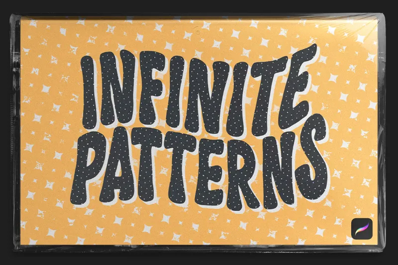
For patterned elements, procreate pattern brushes can be applied on Overlay or Color Burn modes to integrate patterns without covering your base colors. A halftone brush procreate on a Multiply layer adds shading and texture in one stroke.
We also layer complementary colors at very low opacity (10 to 15 percent) on opposite sides of an object. A cool blue shadow on warm orange fabric, for example, creates vibration at the edges that makes both colors feel more alive.
Pair the Right Brushes with Your Palette
Brushes and palettes work together. A flat, hard-edged brush will make even a sophisticated palette look sterile. Conversely, a textured brush can rescue a basic palette by adding visual variety.
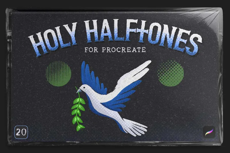
For painterly work, watercolor procreate brushes naturally blend and bloom, mimicking the way wet pigment spreads. For graphic illustration, a pattern brush can fill shapes with visual interest while keeping edges clean. For sketching and linework, the texture in a sketch brush set adds life to what would otherwise be uniform lines.
Match your brush to your intent:
| Style | Recommended Brush Type | Why It Works |
|---|---|---|
| Painterly realism | Watercolor or blending brushes | Natural color variation and soft edges |
| Graphic illustration | Pattern or halftone brushes | Adds texture without softening shapes |
| Sketch and concept art | Sketch or chalk brushes | Rough texture keeps work loose and dynamic |
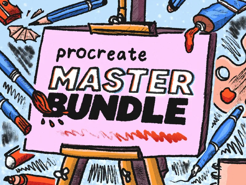
Procreate brushes often come bundled with complementary palettes, which is helpful because the creator has already tested which colors work with that brush texture. If you’re building your own palette, test it with the brushes you’ll actually use, not just the default hard round.
Visit our VisualTimmy discount page to save on curated brush and palette bundles that are designed to work together.
How to Audit Your Current Palette
If you suspect your palette is the problem, run this quick diagnostic:
- Isolation test: paint five squares, each with a different color from your palette, all at the same size. Do they feel cohesive but distinct, or do they blur together or clash?
- Value test: convert to grayscale. Do you see a clear range from light to dark, or are most colors mid-tone?
- Saturation test: do all your colors feel equally intense, or do you have a mix of muted and vibrant?
- Temperature test: are all your colors warm, or all cool? A palette needs both for depth.
If your palette passes these tests but your art still looks flat, the issue is usually application. Go back to the layering, texture, and opacity techniques above.
We also recommend keeping a reference photo or traditional painting nearby. Notice how real-world color is never uniform. Shadows aren’t just darker versions of the base; they shift hue. Highlights catch surrounding light. Texture breaks up smooth areas. Your digital process should mimic these effects, and that starts with how you apply your palette, not just which swatches you pick.
Fixing flat color isn’t about finding a magic palette. It’s about layering temperature, texture, and opacity to build complexity. With the right combination of procreate palettes, textured brushes, and intentional blending, your work will gain the dimension and richness that makes digital art feel tangible.
Questions
Why do my procreate palettes look different on screen versus printed?
Screens use RGB color (emitted light) while prints use CMYK (reflected ink), which has a narrower gamut. Colors that look vibrant on screen, especially bright blues and greens, often appear duller when printed. Work in the Display P3 color profile in Procreate and soft-proof your work before printing to preview shifts.
Can I fix flat colors without repainting everything?
Yes. Add a texture overlay layer set to Multiply or Overlay at low opacity, then create adjustment layers above your existing colors using Soft Light or Overlay blending modes. Paint subtle warm and cool shifts on these layers to add depth without changing your base work.
What is the best way to organize color palettes in Procreate?
Create separate palettes for different purposes: one for neutrals and grays, one for your project's main colors, and one for skin tones if you paint portraits. Name each palette clearly and delete unused swatches to keep them streamlined. The Procreate Handbook covers importing and exporting palettes for reuse across projects.
Do I need a huge palette or just a few colors?
Smaller palettes force you to mix and layer, which naturally creates depth. Start with five to eight colors plus neutrals, then build variations through opacity and blending rather than adding more swatches. A limited palette often produces more cohesive, less flat results than a massive one.
Should I use free palettes or buy custom ones?
Free palettes are great for learning color relationships and testing styles, but premium palettes are often curated for specific use cases like skin tones, landscapes, or vintage illustration. If you work in a niche style, a paid palette designed for that purpose will save hours of trial and error.
How do texture brushes help flat color look better?
Texture brushes introduce variation in opacity and edge quality, mimicking the irregularities of traditional media. Even a single pass with a watercolor or grain brush breaks up the perfectly smooth digital fill, adding visual complexity that reads as depth and realism.
Products in this guide
 Shopping at VisualTimmy? See the discount code
15% OFF All Orders
Shopping at VisualTimmy? See the discount code
15% OFF All Orders
More in this series
Dreamy Sketch Brush Set Review: Is It Worth It for Digital Illustration?3 Sep 20263 minBest Procreate Pattern Brushes for Seamless Background Design3 Sep 20264 minDo Procreate Texture Overlays Work With All Brush Types?3 Sep 20265 minWatercolor vs Halftone Brushes in Procreate: Which Style Fits Your Art?3 Sep 20264 minHow to Install and Organize Procreate Brushes for Faster Workflow3 Sep 20265 min